 how-to
7 Steps to Choose Terrazzo Aggregate Colors That Work
Last Updated: October 31, 2026
Quick Summary
To choose terrazzo aggregate colors, read the binder and base color first, then use a physical color chart to shortlist five or six chips by family, value, and temperature. Set aggregate size and grading before picking hue, and approve the final blend on an on-site sample under real lighting.
- The base color is roughly 50 to 70 percent of what your eye sees at standing height.
- Aim for a dominant family at 60 percent, supporting at 30, accent at 10 or less.
- Set aggregate size and grading before you pick hue, since size controls how the floor reads.
- High-contrast floors show every scuff and soil mark between cleanings.
- Sign-off means a written spec with binder, base pigment, aggregates, grading, and ratio recorded.
Table of Contents
- Why Terrazzo Aggregate Colors Are a Specification, Not a Guess
- Step 1: Read the Binder and Base Color First
- Step 2: Use a Terrazzo Aggregate Color Chart to Narrow the Field
- Step 3: Set Terrazzo Aggregate Size and Grading Before You Pick Hue
- Step 4: Balance Aggregate-to-Binder Proportion and Visual Weight
- Step 5: Build Terrazzo Color Combinations That Fit the Room and Its Use
- Step 6: Approve Terrazzo Flooring Samples Under Real Lighting
- Step 7: Sign Off on the Mix, Then Schedule Installation
- Frequently Asked Questions
Why Terrazzo Aggregate Colors Are a Specification, Not a Guess
Picking terrazzo aggregate colors is a specification decision, not a design hunch. The chips you approve today become a surface that has to survive decades of foot traffic, cleaning chemicals, and daylight.
Here's the part most guides skip. The aggregate blend, the binder, and the base color all interact. Change one and the finished floor shifts. The National Terrazzo and Mosaic Association specification guidance is a useful reference for how mixes are documented.
- Aggregate: the decorative chips, usually marble, glass, or shell
- Binder: the matrix that holds the chips, epoxy or cement
- Base color: the background tone the chips sit in
Get all three right and the floor reads exactly as approved. Get one wrong and you're explaining a color shift to a budget committee.
Step 1: Read the Binder and Base Color First
Start with the binder, because it limits everything downstream. Epoxy vs cement terrazzo affects the base color and overall mix before you choose aggregates. Epoxy terrazzo cures thin and takes pigment well, so it supports deep, saturated base colors.
Read the base color next. That background is roughly 50 to 70 percent of what your eye sees at standing height. The chips are accents, not the main event.
Watch out: choosing chips against a white sample board and then specifying a dark base color. The same aggregate reads lighter or darker depending on what surrounds it, and the floor will look nothing like the board.
Step 2: Use a Terrazzo Aggregate Color Chart to Narrow the Field
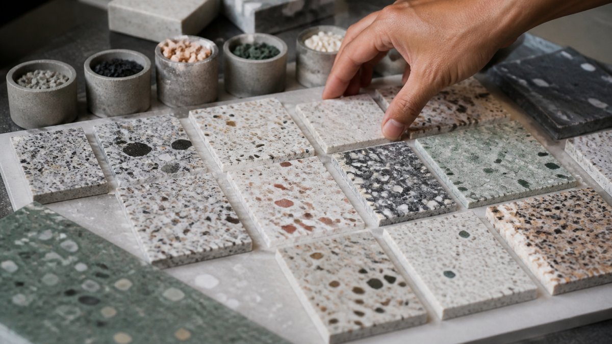
A terrazzo aggregate color chart is a physical set of chip samples grouped by family: whites, grays, blacks, warm earths, greens, blues, and glass. Use it to cut a wide field down to five or six candidates, not to make the final call. The chart is a screening tool, not an approval tool.
Match your base pigment to a chart reference so the installer can reproduce the batch. A verbal description like "warm gray" means something different to every person in the room. Write the reference down.
How to actually read a chart
Charts are organized by family, then by value (light to dark), then by temperature (warm to cool). Work the chart in that order:
- Family first. Pick one dominant family, one supporting family, and one accent. That structure keeps you from building a mix that looks busy at chip scale but muddy across a whole corridor.
- Value second. Within each family, pull the light, mid, and dark chips and lay them side by side. Value contrast drives how much pattern the floor shows at standing height.
- Temperature third. Warm chips (creams, tans, warm grays) and cool chips (blue-grays, greens, glass) behave differently under the same light. Mixing temperatures is fine, but do it on purpose.
Build a shortlist, not a final blend
Pull five or six chips that fit your family plan and tape them to a single card. Label each with its chart reference. This card travels with you to the sample panel review in Step 6. A common pattern is to shortlist two dominant candidates, two supporting, and two accents, then let the on-site sample decide.
- Dominant family: 60 percent of the visual weight
- Supporting family: 30 percent
- Accent: 10 percent or less
Watch out: choosing chips against a white sample board and then specifying a dark base color. The same aggregate reads lighter or darker depending on what surrounds it, and the floor will look nothing like the board. Always view shortlisted chips against a base-color swatch, not against white.
Step 3: Set Terrazzo Aggregate Size and Grading Before You Pick Hue
Aggregate size decides how the floor reads from a distance, and it matters more than most people expect. Small chips blend into a fine, even field. Large chips create movement and visible pattern.
Grading keeps the mix consistent. A blend that mixes sizes from fine to coarse fills the gaps between big chips, which gives a denser, more uniform surface. Skip the grading and you get pockets and patchiness.
- Fine grading: subtle, calm, hides scuffs well in high-traffic zones
- Medium grading: the most common commercial choice
- Coarse grading: bold, dramatic, best in large open areas
Insider note: in a small room, coarse chips can overwhelm the space. In a big terminal or lobby, fine chips can disappear.
Step 4: Balance Aggregate-to-Binder Proportion and Visual Weight
The aggregate-to-binder ratio controls how loud the floor is. A high aggregate load puts chips front and center. A lower load lets the base color carry the design. Neither is better; they answer different briefs.
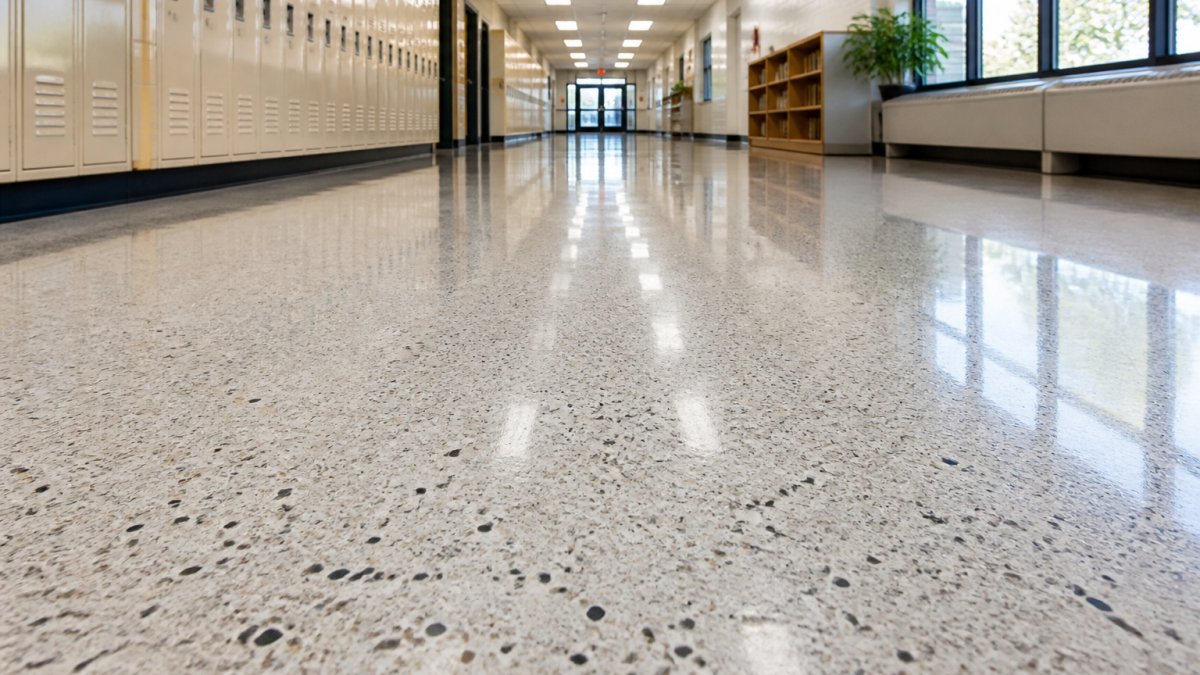
Think in visual weight. A dark base with light chips creates high contrast and strong pattern. A tonal mix, where chips sit close to the base color, reads quiet and seamless. Healthcare corridors usually want the tonal end.
What most guides miss is that contrast amplifies wear. A high-contrast floor shows every scuff and soil mark between cleanings. That's fine in a lobby with a maintenance crew.
Step 5: Build Terrazzo Color Combinations That Fit the Room and Its Use
Terrazzo color combinations should follow the room's job, not the other way around. A hospital corridor, an airport concourse, and a university commons all need different answers. Most guides treat color as purely decorative; the practical move is to score each candidate palette against traffic, cleaning, and visual clarity before you fall in love with it.
Score the palette against four use factors
Run every shortlisted combination through these four questions:
- Traffic level. High-traffic zones wear fastest at entries, corners, and main paths. Mid-tone blends with medium grading mask scuffs and soil better than very light or very dark fields.
- Dirt visibility. Light tonal mixes hide dust and fine soil; dark bases hide scuffs but show light dust and salt tracking. Match the base value to what the cleaning schedule actually removes.
- Cleaning schedule. A high-contrast floor shows every mark between cleanings. That is fine in a lobby with a maintenance crew; it is a headache in a facility running a lean schedule. If cleaning is infrequent, favor tonal mixes over high contrast.
- Visual clarity. Strong, busy patterns can make it harder to read pathways, edges, and level changes. Keep contrast at the edges and stairs deliberate so the surface stays safe for everyone, including visitors with low vision.
Room-by-room starting points
- Healthcare corridors: light tonal mixes that hide soil and support a calm read; keep pattern density low so wayfinding stays clear.
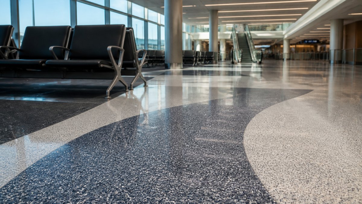
- Transit and concourse areas: mid-tone blends with medium grading hold up best and mask scuffs; use contrast at edges to define paths.
- Schools and universities: warmer earth tones and mid-grays forgive heavy use; avoid very light bases near entrances where salt and grit track in.
- Showcase lobbies: higher contrast and coarser chips are appropriate when a maintenance crew is on site daily.
- Historic restorations: match the original aggregate and base first, chip by chip against the existing floor, before considering any modern substitution.
A simple decision framework
- If the room is high-traffic and cleaned often, choose mid-tone contrast.
- If the room is clinical and needs a calm feel, choose tonal light mixes.
- If the room is a showcase space, choose higher contrast and coarser chips.
- If the building is historic, match the original aggregate and base first.
- If cleaning is infrequent, drop the contrast one step and favor tonal blends.
Step 6: Approve Terrazzo Flooring Samples Under Real Lighting
Terrazzo flooring samples must be approved on site, under the light the floor will actually live in.
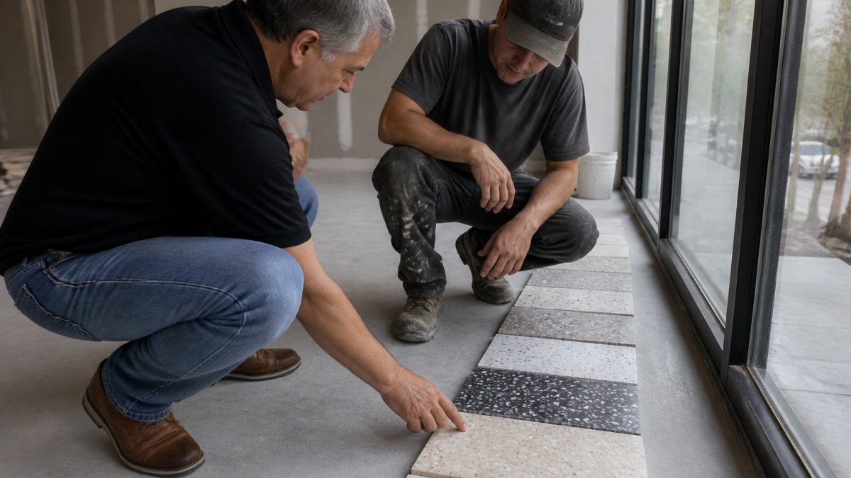
Ask for a sample panel large enough to read at standing height, not a single chip. View it at different times of day.
This is also where you guard against color shift over time. Learn how to prevent terrazzo floor discoloration so the approved colors stay true.
Watch out: approving a sample in a fluorescent-lit office and installing under daylight LEDs. That mismatch is one of the most common reasons owners feel the finished floor "doesn't match."
Step 7: Sign Off on the Mix, Then Schedule Installation
Sign-off means a written spec: binder type, base pigment reference, each aggregate by family and size, the grading, and the ratio. Everyone signs the same document, and the sample panel is retained as the standard.
Once that's locked, you can schedule with confidence. Review the commercial terrazzo flooring cost per square foot before committing to scheduling. See the commercial terrazzo installation process step by step so you know what happens next.
A sample approval checklist keeps the sign-off honest:
- Binder type confirmed in writing
- Base pigment matched to a chart reference
- Each aggregate named by family and size
- Grading and ratio recorded
- Sample panel approved on site under real light
- Panel retained as the standard for the batch
| Step | What You Decide | Why It Matters |
|---|---|---|
| 1 | Binder and base color | Sets the limits for every chip choice |
| 2 | Aggregate families | Narrows the field to a workable shortlist |
| 3 | Size and grading | Controls how the floor reads at distance |
| 4 | Ratio and contrast | Balances visual weight against wear |
| 5 | Room-fit palette | Matches color to use and traffic |
| 6 | Sample approval | Confirms color under real light |
| 7 | Written sign-off | Locks the spec before installation |
Choosing terrazzo aggregate colors gets a lot easier when you work the sequence and lock the spec before installation. That's where A1 Terrazzo comes in.
Frequently Asked Questions
How do you match terrazzo aggregate to the base color?
Start with the binder, not the chips. A dark base absorbs light and dulls light chips, which is why black and charcoal binders usually pair with high-contrast white or glass aggregate. Cement terrazzo binders shift toward gray and warm tones, so aggregate colors read slightly muted. Ask for a sample poured with your exact binder and pigment before you commit.
How does aggregate size affect the look of terrazzo?
Terrazzo aggregate size controls scale and visual noise more than color does. Large chips in the 6 mm and up range read as bold and graphic, which suits lobbies and concourses viewed from a distance. Mid-range chips give a balanced, classic terrazzo look. Fine chips and grit below 2 mm read almost as a solid tint from standing height, so they hide scuffs and soil well in corridors and patient areas. Mixing two or three graded sizes in one blend creates depth without adding color complexity.
Can you preview terrazzo colors before installation?
Yes, and you should insist on it. A physical sample poured from your actual binder, pigment, and aggregate blend is the only reliable preview. Look at it in the room where it will be installed, at different times of day, because terrazzo aggregate colors shift under fluorescent, LED, and daylight. Compare the sample against your wall paint, casework, and adjacent flooring. Keep the approved sample on file as the reference for the whole project so the installed floor can be checked against it.
Should terrazzo aggregate colors contrast or blend with the matrix?
Both work, but they signal different things. High contrast between aggregate and binder makes a floor read as a statement surface and shows pattern clearly from a distance. Low contrast, tonal blends look calmer and hide chips and repairs better over decades of use. For healthcare and school corridors, tonal blends with a few accent chips are easier to maintain. For lobbies and terminal entrances where the floor is part of the brand impression, stronger contrast earns its place.